Translating business objectives into strategic, creative, multi-platform solutions that engage + excite clients + fans alike!


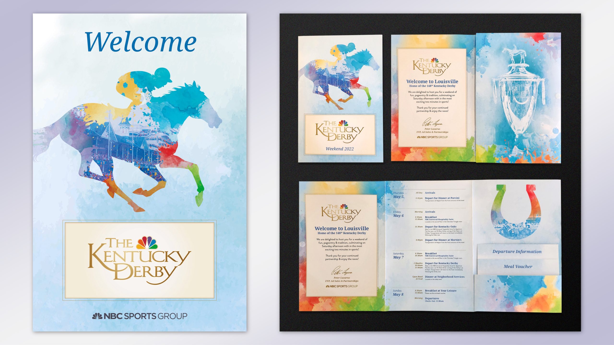
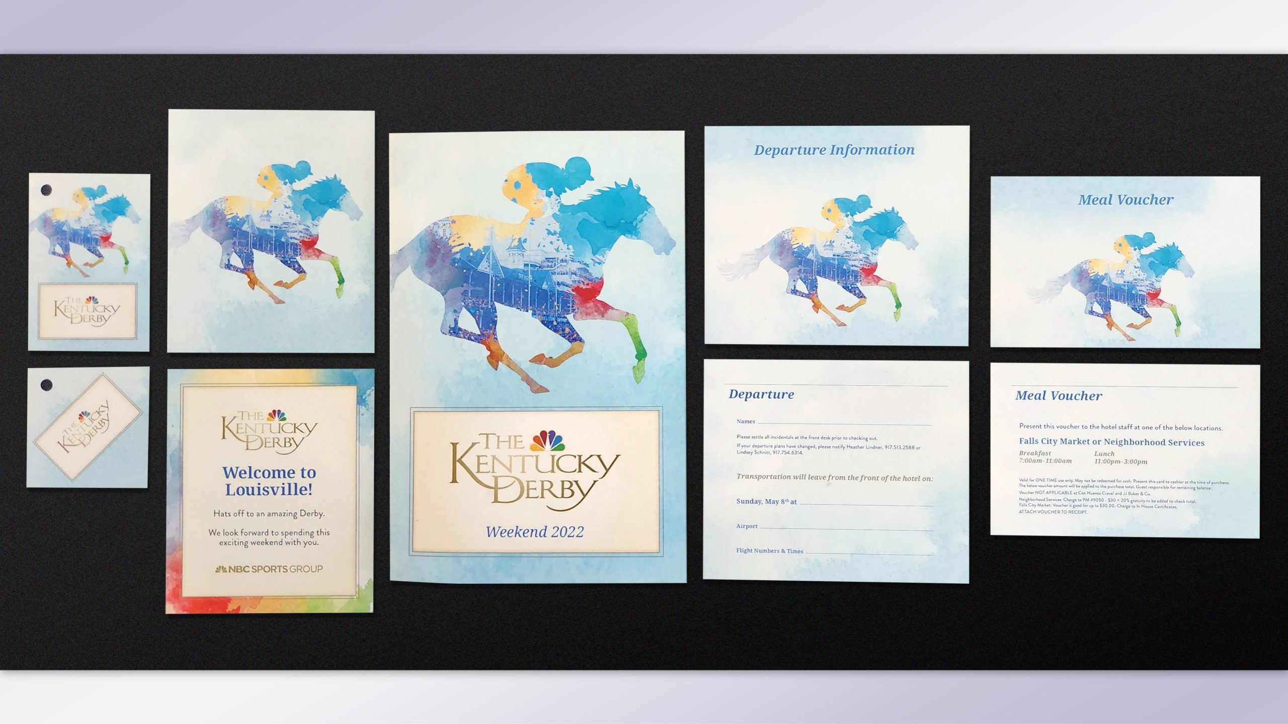
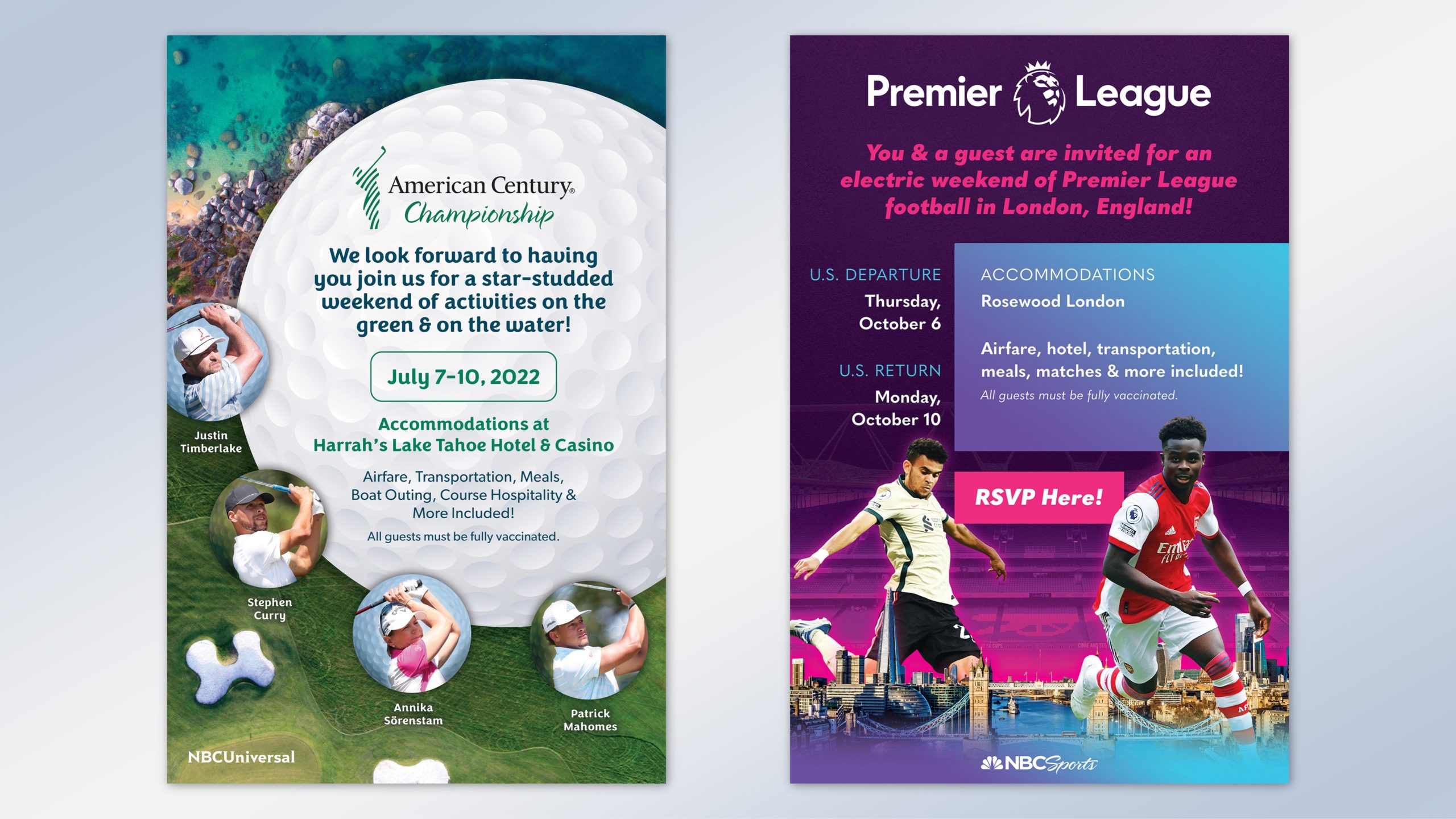
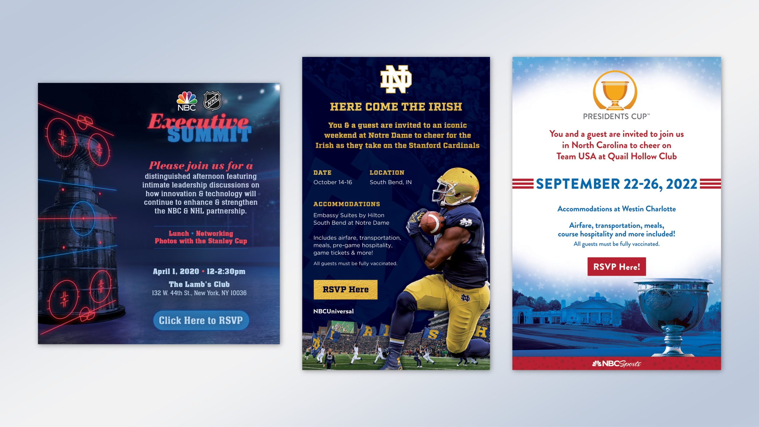
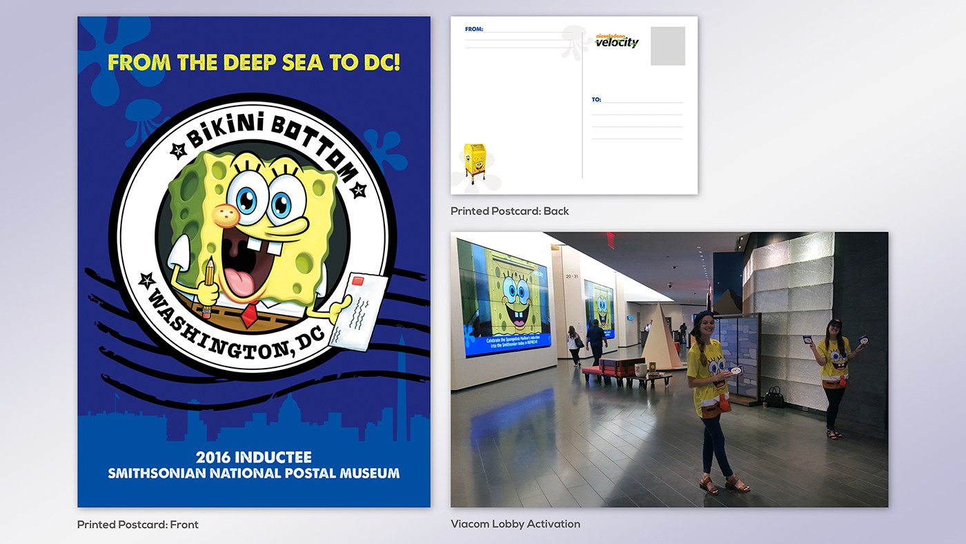
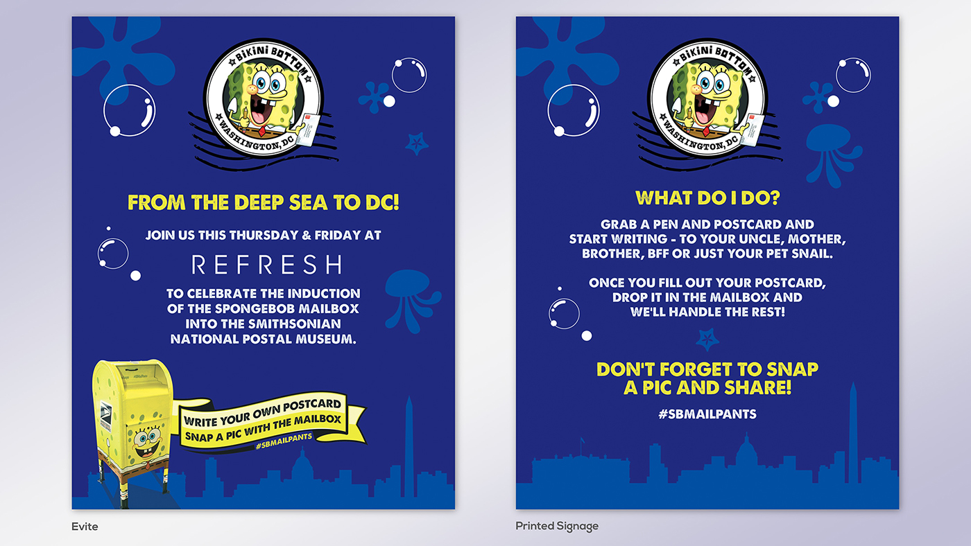
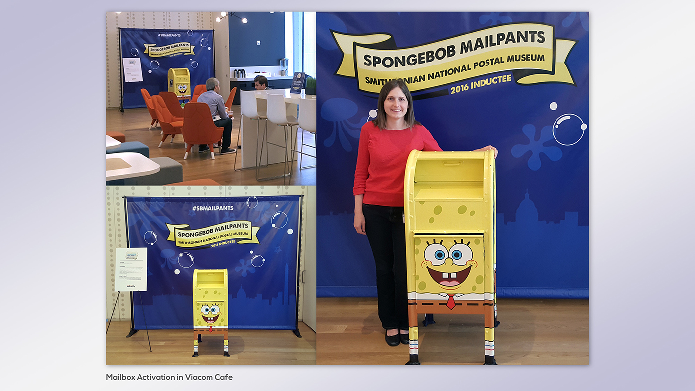
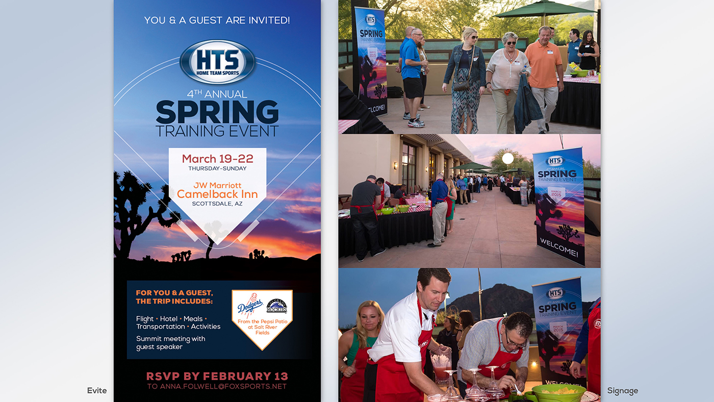
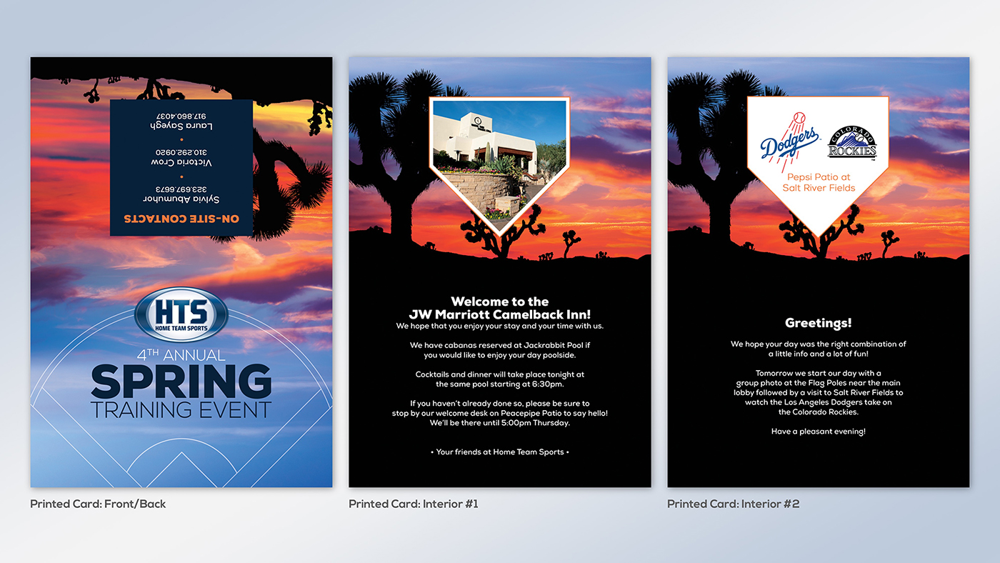
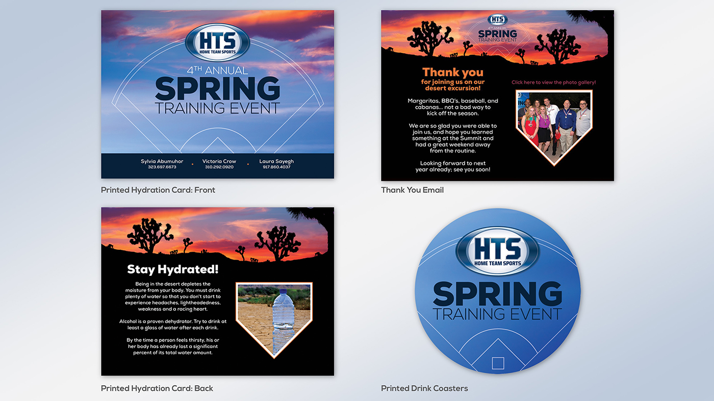
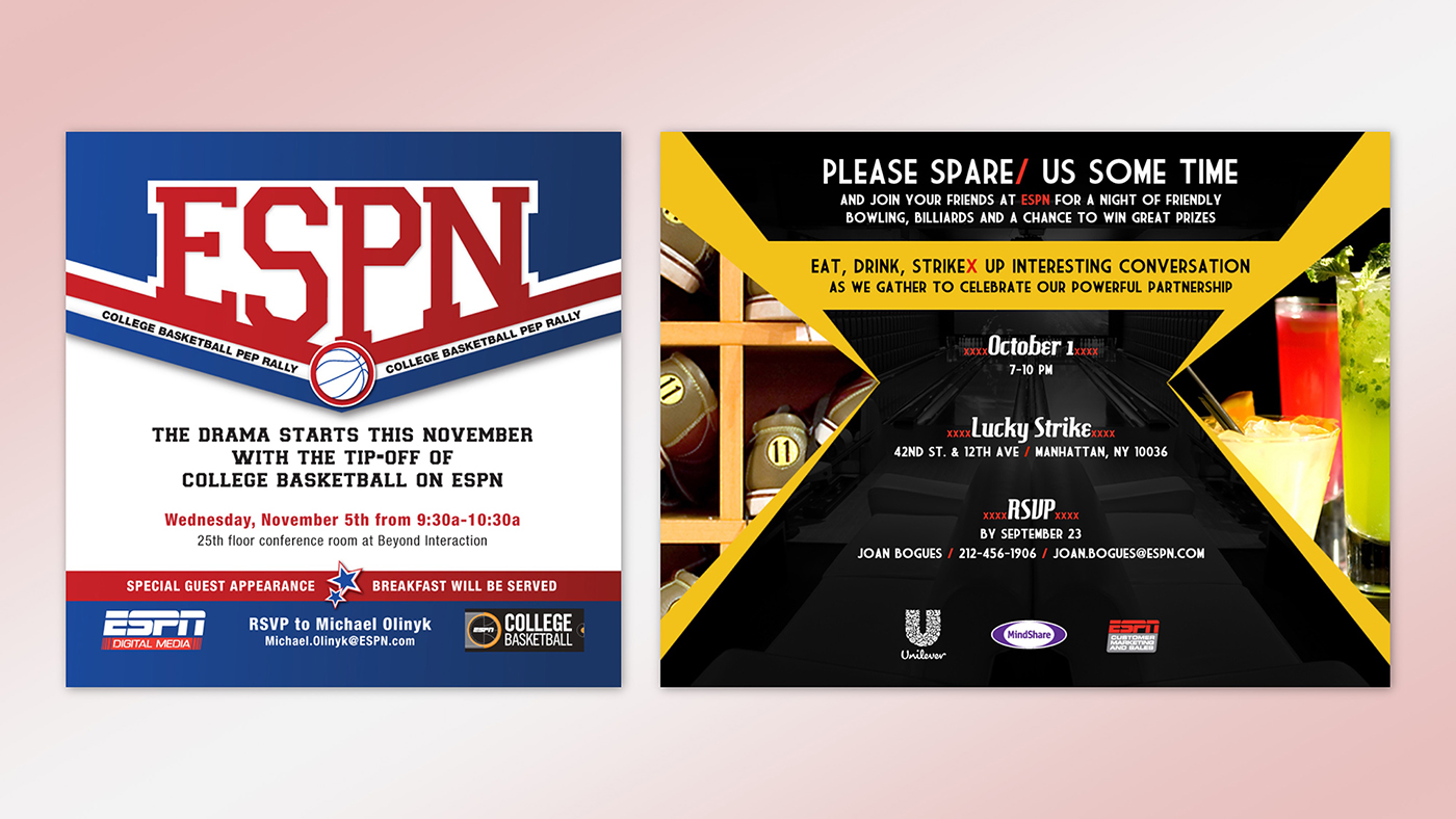
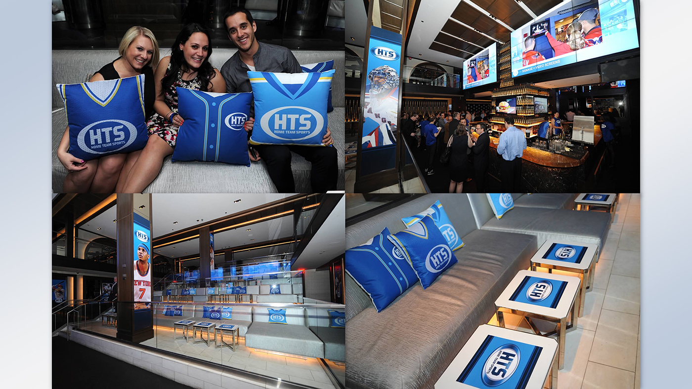
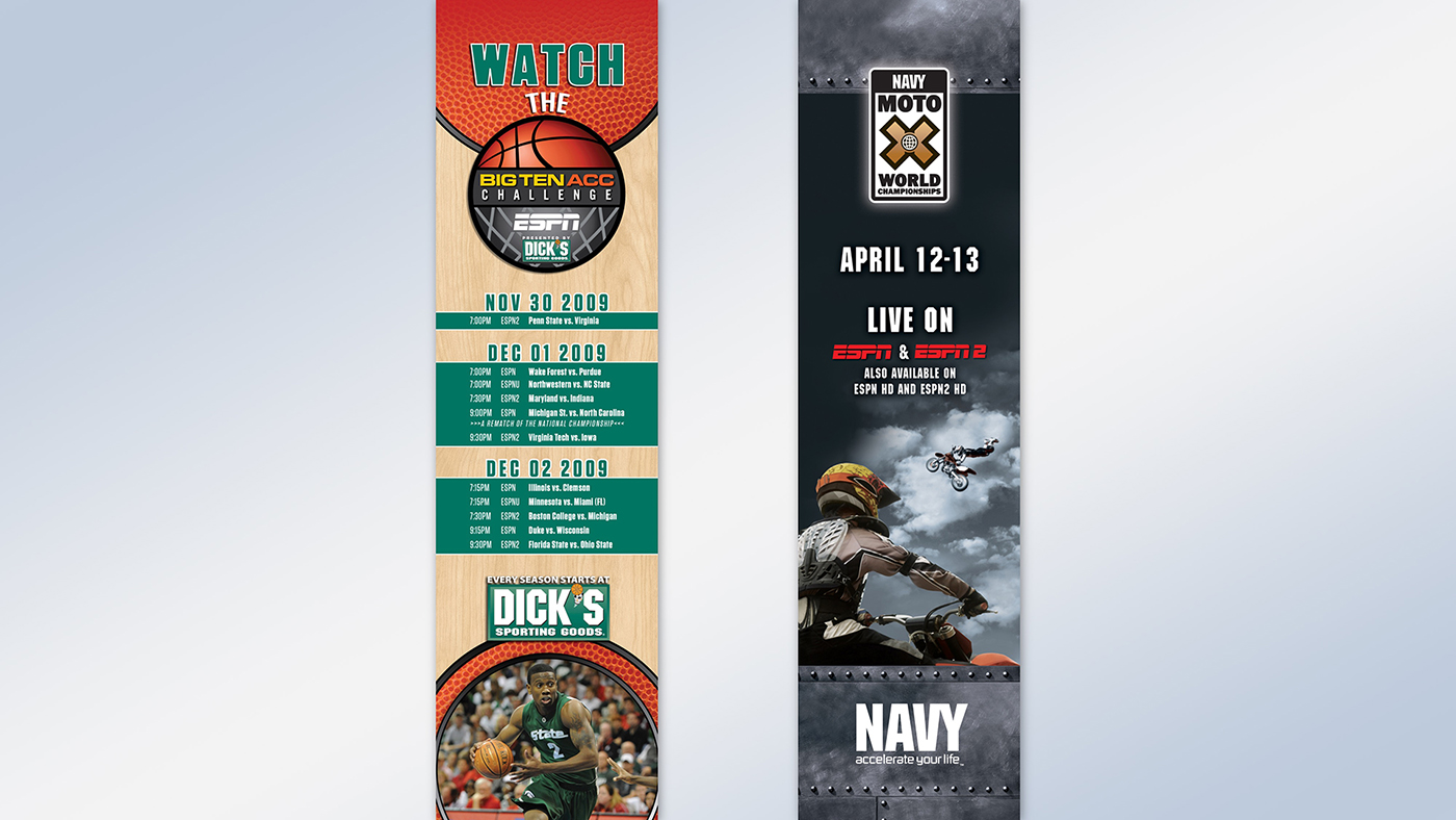
EVENTS
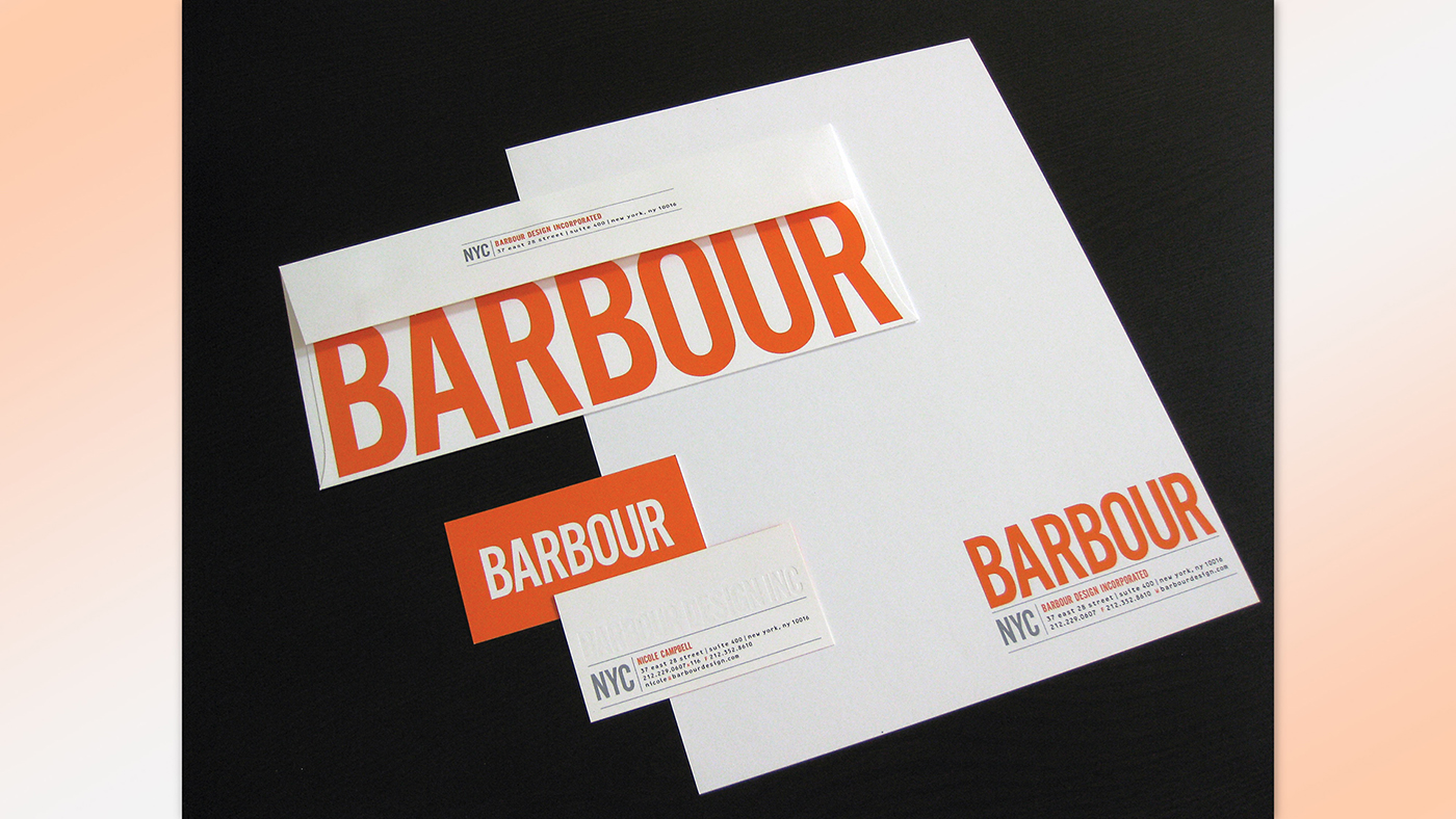
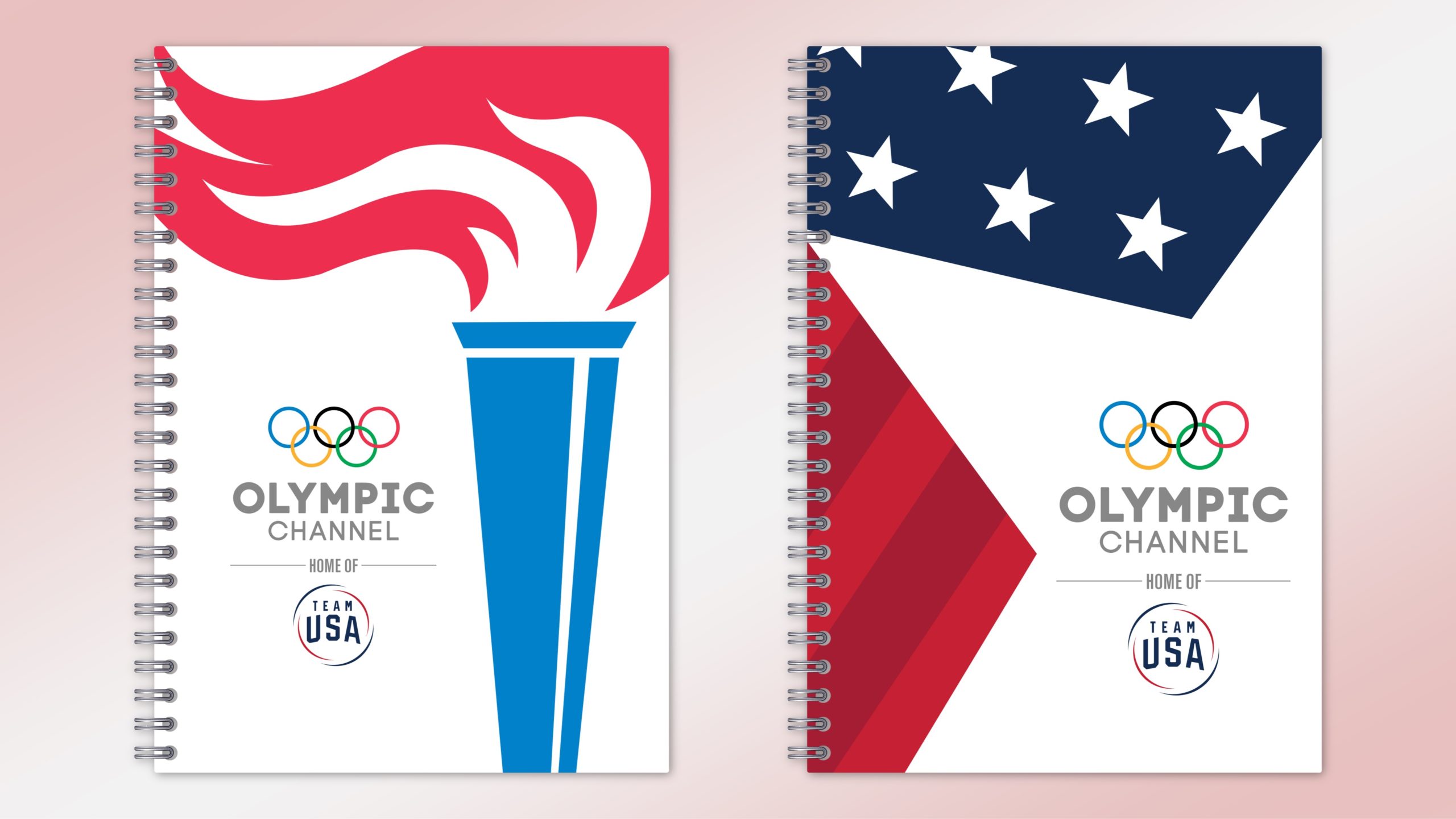
BRANDING
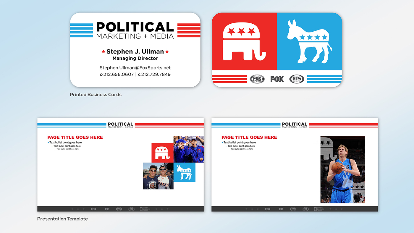
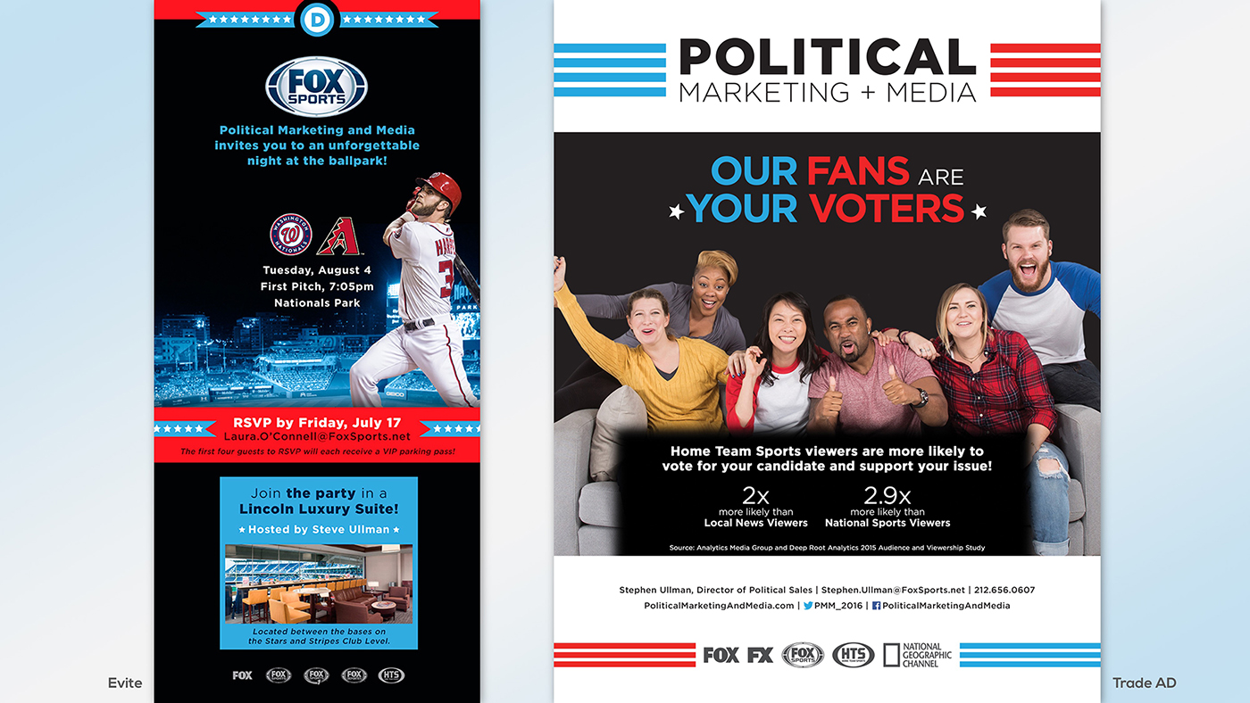
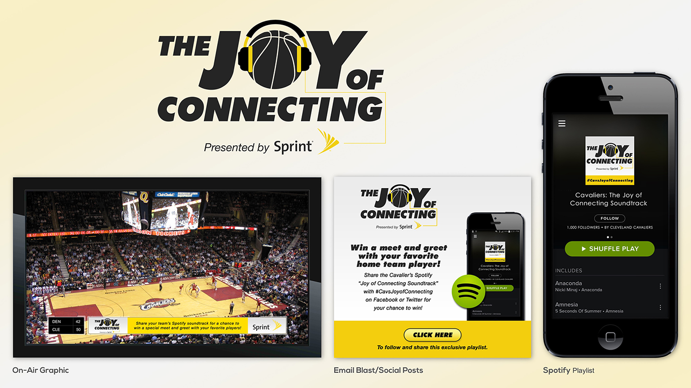
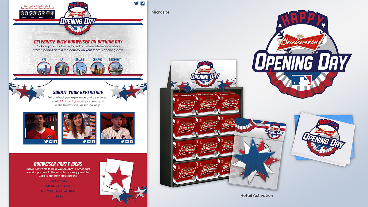
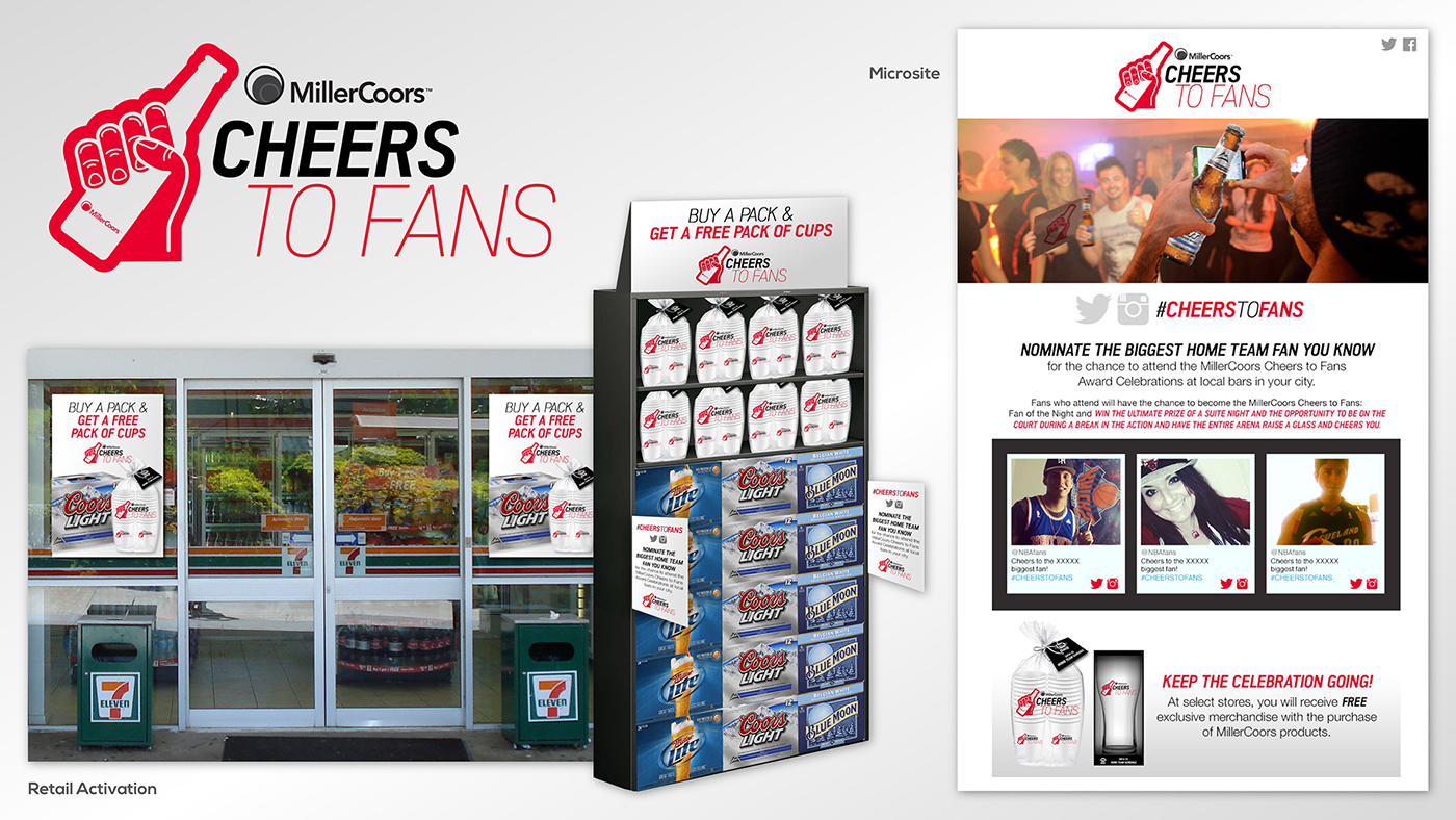
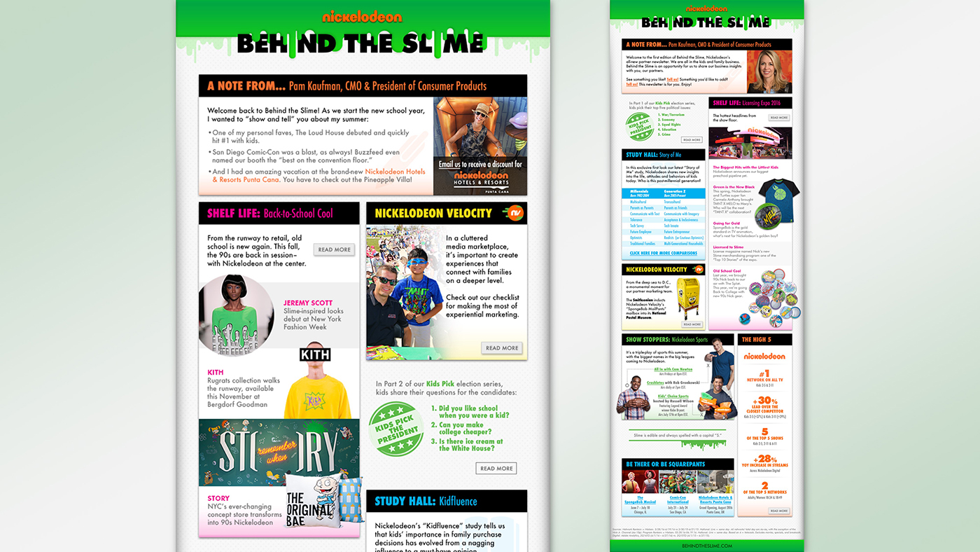
PARTNER MARKETING ▸ PITCH IDEAS
PRESENTATIONS
DIGITAL
VIDEO
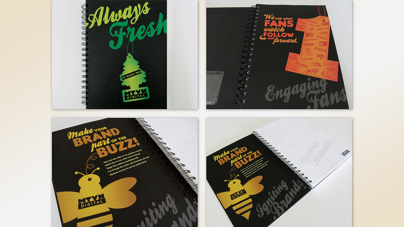
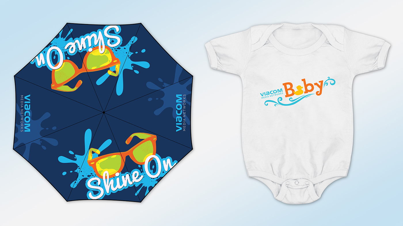
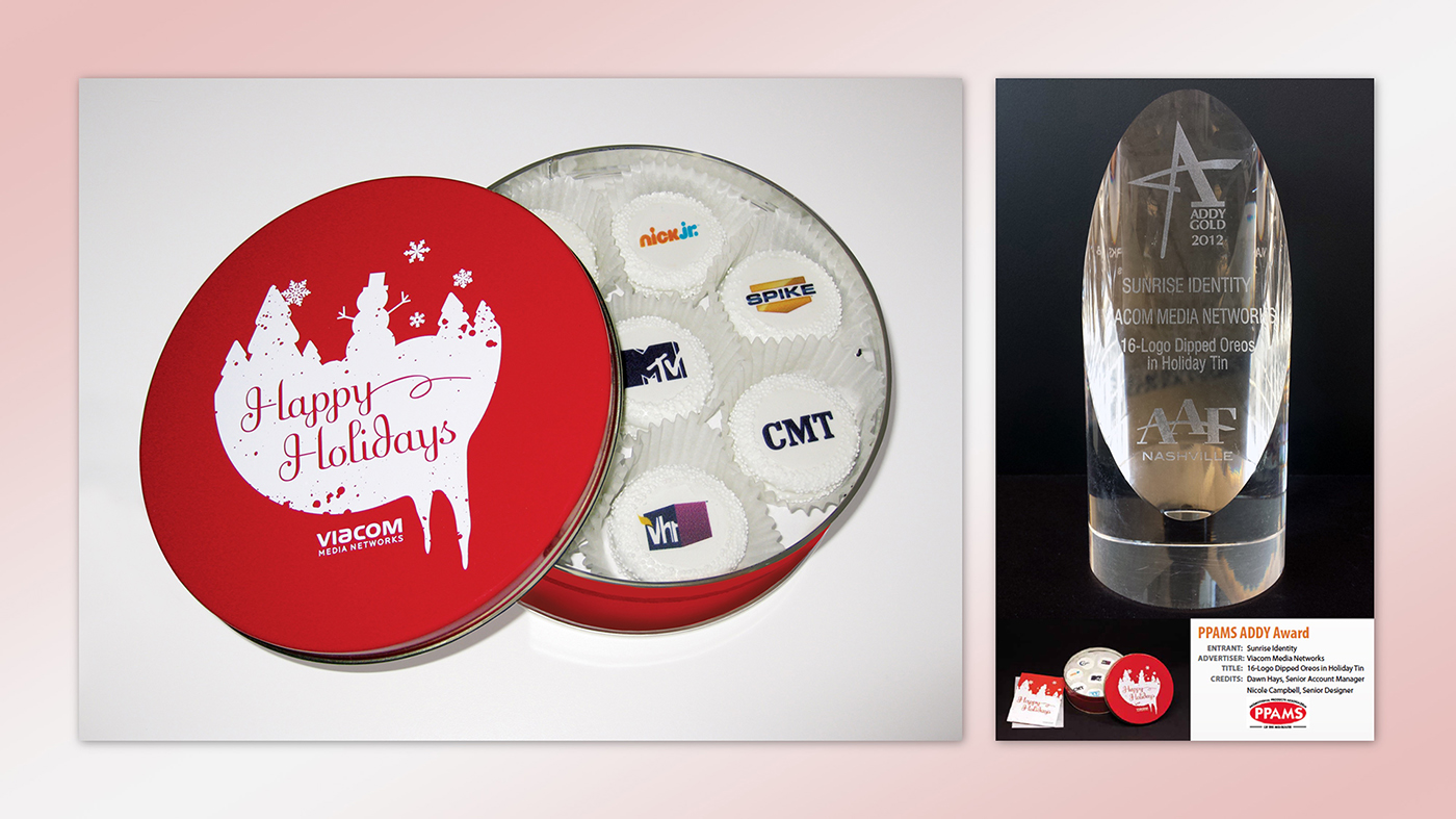
PREMIUMS

Hi!
My name is Nicole, and I graduated from Rochester Institute of Technology with a BFA in graphic design and a minor in communications.
I’ve spent the last seventeen years working in the sports, music and entertainment industries where I have leveraged my creative vision to meet the marketing and sales goals of top media companies like ESPN, Viacom, Fox Sports and NBCUniversal.
My passion for media, travel, art, pop culture and new experiences inspires me on a daily basis. Please check out my Instagram to see my interests in action!